Top and bottom app bars
The way color is applied to the top and bottom app bars helps users identify them and understand their relationship to surrounding UI elements.
Identifying app bars
Top and bottom app bars use an app’s primary color. System bars can use a dark or light variant of the primary color to separate...
Top and bottom app bars use an app’s primary color. System bars can use a dark or light variant of the primary color to separate system content from top app bar content.

Do.
The primary color (purple 500) is used on this top app bar, and a dark primary variant (purple 700) is used on the system bar.
To emphasize the difference between app bars and other surfaces, use a secondary color on nearby components such as the FAB.
To emphasize the difference between app bars and other surfaces, use a secondary color on nearby components such as the FAB.
Do.
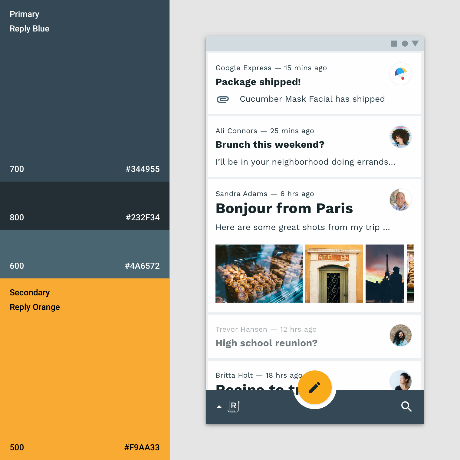
The primary color (blue 700) is used on this bottom app bar, and the secondary color (orange 500) is used on the floating action button

Caution.
If the bottom app bar and floating action button are the same color, use shadow or alternate means to create enough distinction between them.
Blending an app bar with the background
When an app’s top or bottom app bar color is the same color as the background color, they blend together, placing emphasis on an app’s...
When an app’s top or bottom app bar color is the same color as the background color, they blend together, placing emphasis on an app’s content instead of its structure.
Both this app’s top app bar color and the background color is the primary color: white. However, on a scroll, the top app bargains a shadow, showing it has an elevation higher than the content that scrolls behind it.

This app’s bright, seamless layout uses its primary blue (blue 700) color for app bars, bottom navigation, and the background color, so individual elements stand out less, and content stands out more. The activation state uses the secondary yellow. It includes a shadow on the bottom navigation to show the elevation division between surfaces.
Backdrop
A backdrop has a front and back layer. To distinguish between these two layers, the baseline back layer color is your primary color and the baseline front layer is white.
Backdrop
A backdrop has a front and back layer. To distinguish between these two layers, the baseline back layer color is your primary color and the baseline front layer is white.
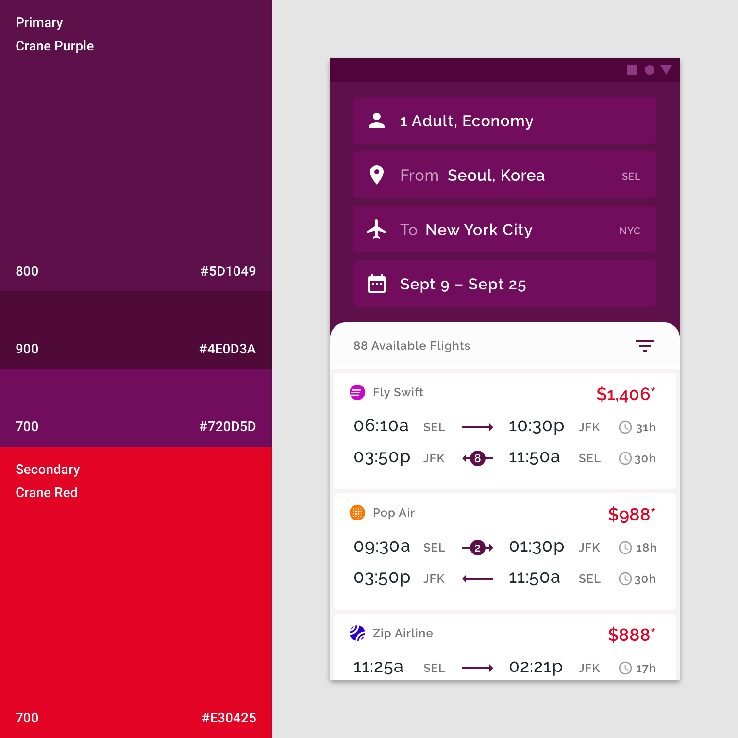
This app uses its primary color (purple 800) on the backdrop’s back layer. The text fields are a light primary variant (purple 700). A secondary color (red 700) is applied as an accent to the flight fares.
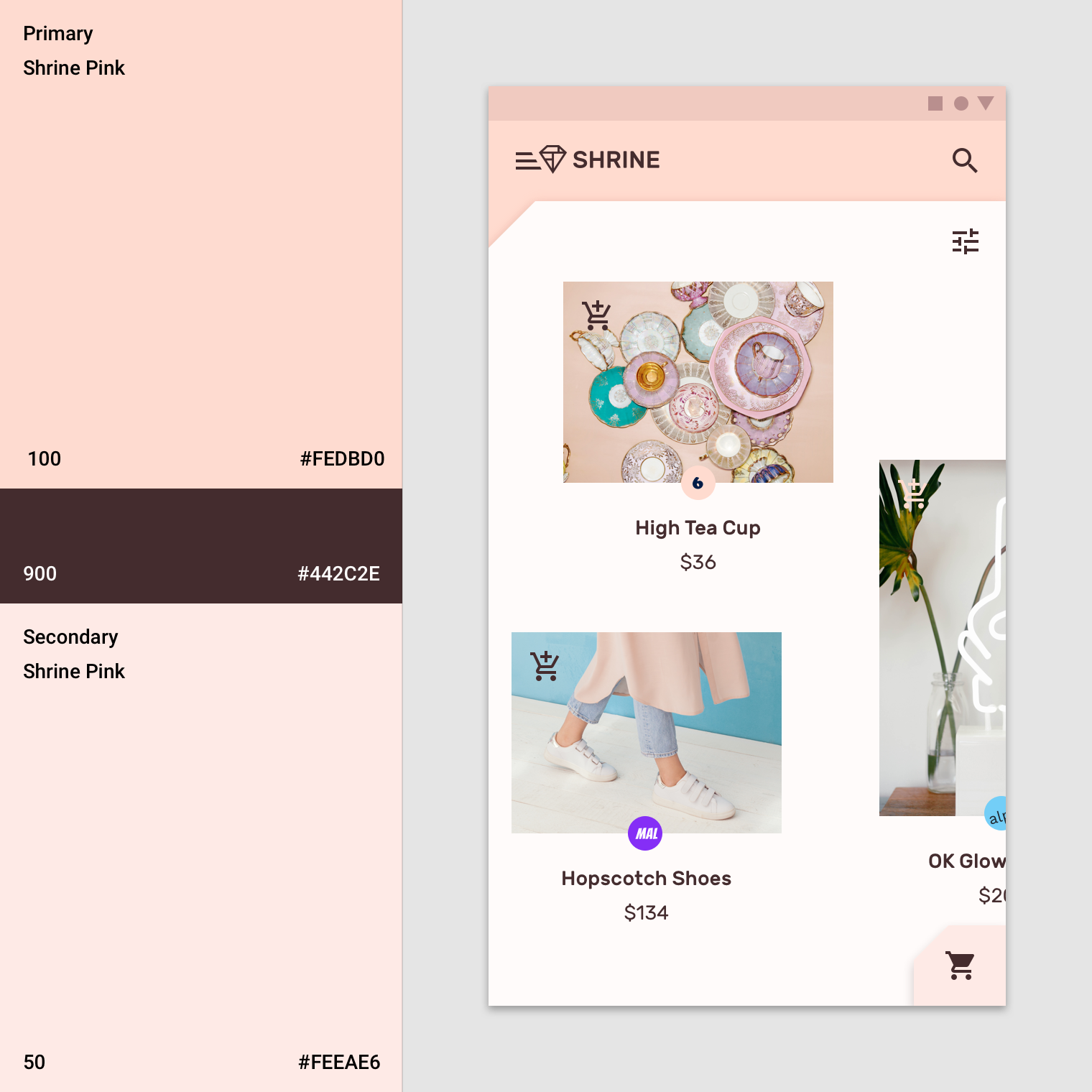
This app uses the primary color (pink 100) for the backdrop’s back layer and the primary dark primary variant (pink 900) for typography and iconography. Additionally, the secondary color (pink 50) is used for the expanding sheet on the front layer.


Comments
Post a Comment